
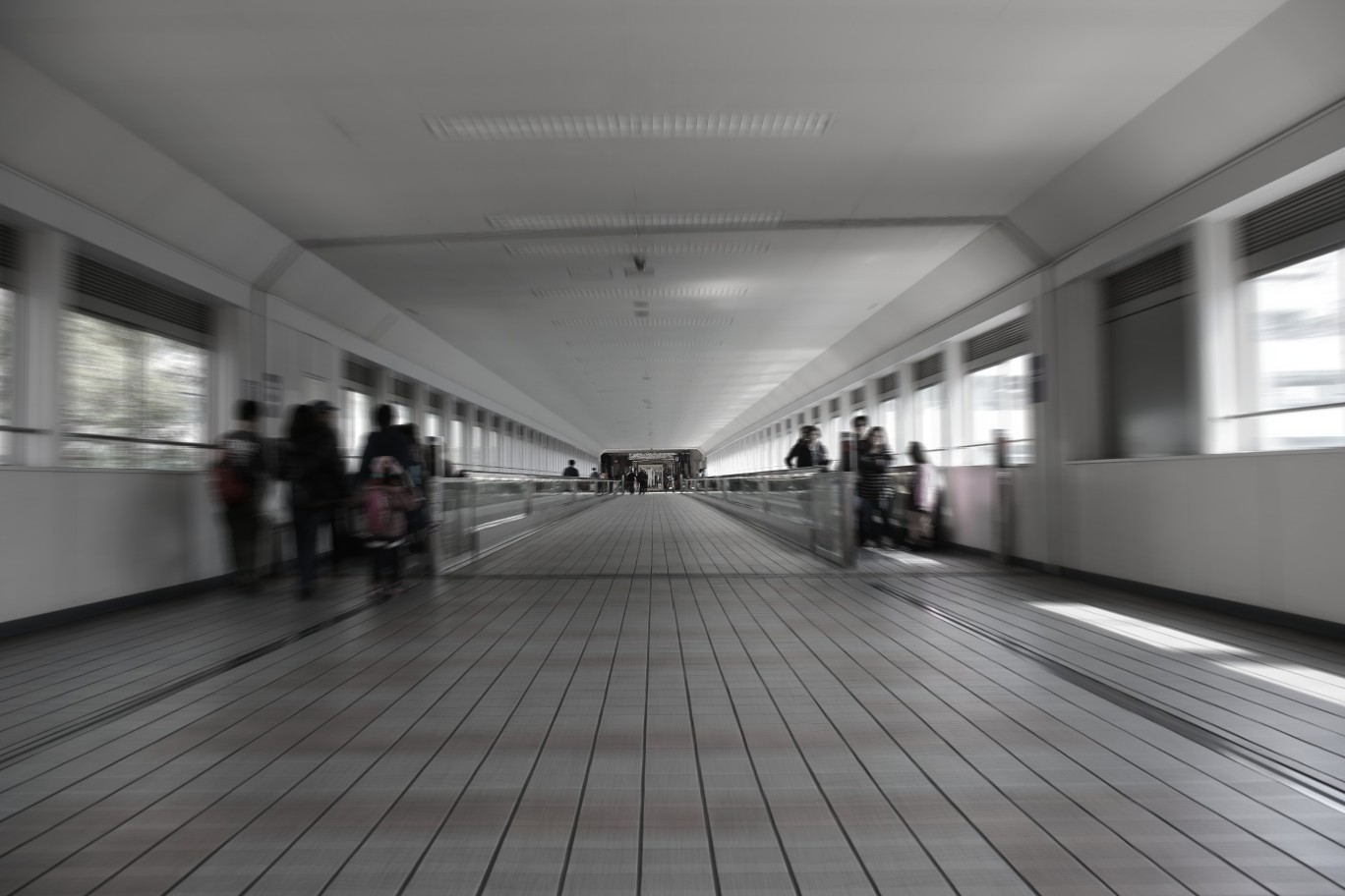
Mostly hueless, low saturated and not-monochrome-but-monotone pictures would be what I intend to pick up here. That’s why ‘mostly’.
ほぼ色がなく彩度の低い、モノクロではないが単色の絵がここで取り上げようとしているものなのだろう。
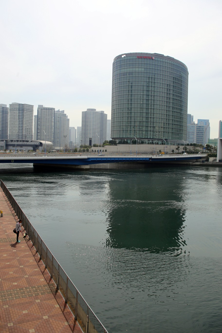
Interestingly, lines are looked out of horizontal and unstable but level. As usual, another picture with colours is added below. Two pictures were taken at Yokohama Bay Quarter
面白いことに、それぞれの線は水平ではなく不安定に見えるが、水平である。いつものように色のある他の写真も下に追加する。2枚の写真は、横浜ベイクォーターで撮影したものである。
The post is also my second contribution to WPC: Blur.

What is that top photo? It looks a little bit like a big ferry. Is it a covered walkway between buildings?
That’s right. It’s a pedestrian bridge between two buildings, one of which was designed in the motif of a big ferry.