
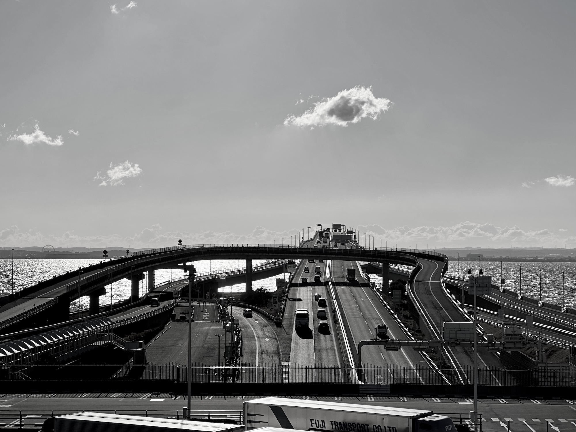
Color usually conveys a lot of information. In most cases, that’s true. But sometimes, like in cityscapes, color is just part of the symbolism. That’s why I prefer monochrome photography. Some information may be lost, but rather, information such as shapes that you don’t notice in color may be added, and the photo may be found to be fail.
This photo was taken with an iPhone. I had my camera with me, but I needed mobility, so I left the camera in the car and took the photo with my iPhone. If you can’t look through the viewfinder, you may actually take more interesting photos by a smartphone.
Lens-Artists Challenge #335: Exploring Color vs Black & White
(意訳)色は、一般的には、たくさんの情報を伝えるものだ。ほとんどの場合、それは事実である。しかし、都市の風景のような場合では、色は単なる象徴の一部に過ぎないこともある。だからこそ、モノクロ写真を好んでいる。一部の情報は失われるかもしれないが、むしろ、色では気づかない形状などの情報が追加され、かえって写真が失敗となることもある。
この写真はiPhoneで撮影したものだ。カメラは持っていたが、機動力が必要だったので、カメラは車に置いてiPhoneで写真を撮った。ファインダーを覗けないような場合では、スマートフォンで撮影した方が実際にはもっと面白い写真が撮れることもある。


Wow, Tanu! What a difference the edits make! I love the black and white edit. It’s so captivating and beautiful. Excellent work!
Thank you for your message. It was a windy and cold day to take photos, but I think the photos turned out pretty interesting.
A very interesting post Tanu. Because the sky was a rather muted color, the two versions are fairly similar. Like you I prefer the B&W but only slightly.
Metallic roads, metallic trailers, metallic sky, metallic water, and metallic air. Good to make an imagination in B&W.
I agree with you, Tanu and the photo you picked is a perfect example on how black & white works with city subjects.
Thank you. What a wonderful thing photography is!
🙂